Web Development – Search Engine Marketing & Hosting
Responsive
One of the biggest challenges in web design is getting your design to look perfect across all devices.
This is a challenge not only for designers, but for the simple WordPress user as well. It can be SO frustrating using an off the shelf theme. We design and build from the ground up, we do not buy themes, we create them for each specific customer.
Mobile Editing: The Only Way to Create Truly Responsive Sites
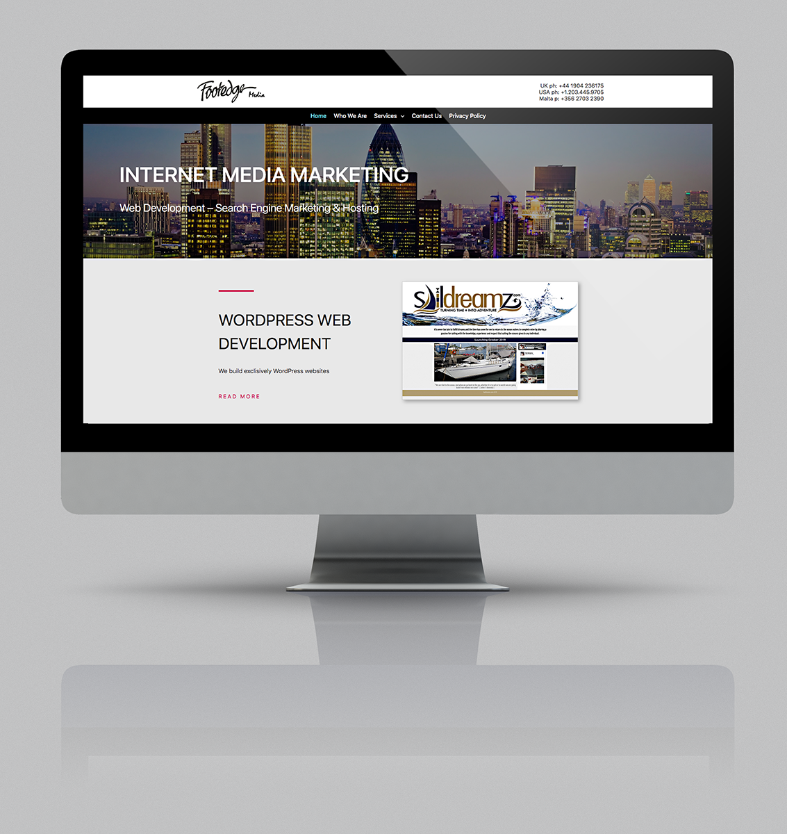
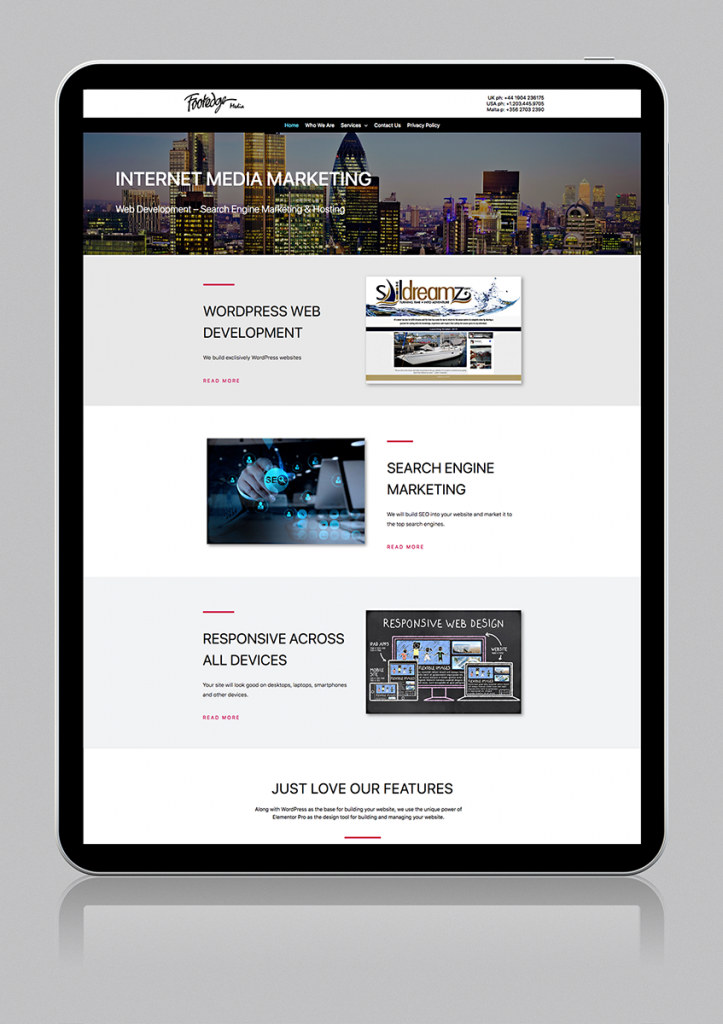
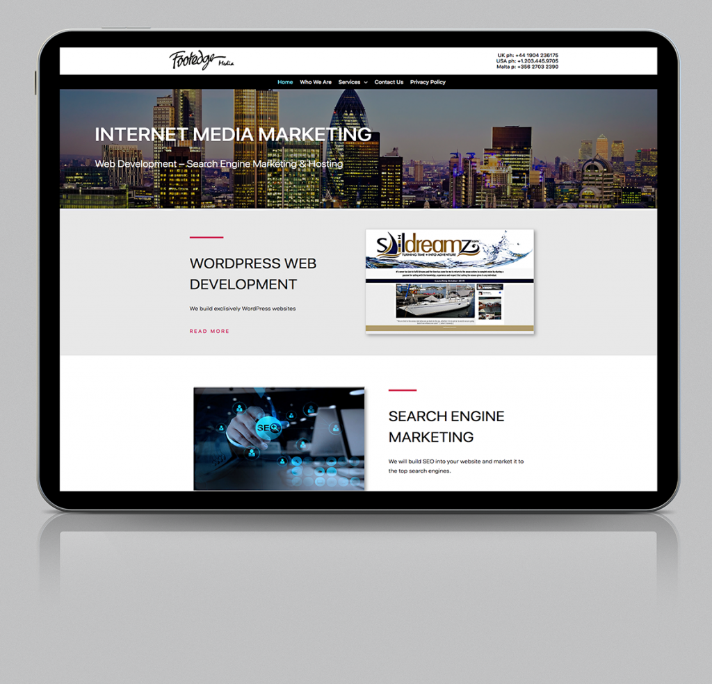
By building our sites using Elementor Pro and other plugins to complement it, we can offer the very best in web design that works on all formats. Below, you can see how a website should look on a desktop, tablet and smartphone.
Desktops
At Footedge Media, our commitment is to build creative State-of-the-Art websites.
Elementor Pro has revolutionised the use of WordPress and along with Elementor, there are other software developers that have created plugins to take Elementor to a higher level.
Tony Foote
Founder
Tablets
Getting your site to work both vertically and horizontally can be challenging. At the moment, WordPress and Elementor design for vertical alignment, however things should improve in the future.
Smart Phones
Editing Suite
Mobile Editing lets you set different font sizes for any text element, on tablet and mobile devices. This means you can set a separate size for the mobile heading, so it no longer takes the whole screen, and fits the mobile screen better.
Similarly, you can also set different line-height and letter-spacing for tablet or mobile devices.
Different images can be used for headers for each mode, desktop. tablet and phone, which enables variety.
Take a look at some of the sites on the website development page with both a tablet and phone and you will see the mobile editing results.
